Designing safety signs for evacuation centers
March, 2001Mr. Yukio Ota/ President, Ota Yukio Design Associates
Text by Satoshi FujitsukaDesigning safety signs for evacuation centers
Mr. Yukio Ota/ President, Ota Yukio Design Associates
Yukio Ota is a long time contributor to the development of public safety signs and pictograms. The Great Hanshin-Awaji Earthquake + Creative Timeline Mapping Project asked Ota about the current situation involving public evacuation area signage, as well as his insights into the future development of pictograms.
Do the safety signs reflect our learning from the earthquake?
Japan is an earthquake-prone country with limited inhabitable land, and there are many wooden houses that are vulnerable to fire. The urban sprawl in the country has developed areas in which the streets are too narrow for fire engines to enter. I have been advocating that this kind of environment makes it inevitable for us to consider evacuation as not only the evacuation of a damaged building, but rather a seamless system that enables victims to seek safety from the building and to rapidly navigate to an evacuation center. However, things have not moved so smoothly, due to the Japanese bureaucratic sectionalism that divides the supervision of indoor and outdoor safety signage regulations between different government bodies.
After 37 years getting involved in the development of ISO certified safety signs, I faced a new issue regarding use of phosphorescence for emergency exit routes. I served as the only Japanese representative in the international working group and despite my 15 year protests, the representatives of phosphorescent material manufacturers coming from all around the world developed an international standard that required a 10cm phosphorescence tape to be used to create the guidance system, by lining it throughout the architecture from the floor to the walls and stairs. When this standard was introduced in Japan, a committee for a large-scale pilot was organized, for which I served as the chair. To roll out the standard without interfering with interior designs, we modified the ISO specification and developed a Japanese national standard in which the tape width can be set narrower. The result was not only well received in Japan, but also praised highly in the United States.
The pictogram for safety evacuation area was developed in response to the Great Hanshin-Awaji Earthquake. Mr. Nobuo Ishihara, who had formerly served as the Deputy Chief Cabinet Secretary supporting seven Japanese prime ministers , and was at the time the chairman of a Japanese non-profit organization BOUSAI JYOUHOU KIKOU (Disaster Prevention Information Center), brought together the related government ministries and agencies, and they selected my design as the nation-wide universal symbol..
Designing a seamless system for evacuation route navigation
After the earthquake, a project was launched to create a new, safer way guidance system to help evacuees smoothly find an emergency exit, and eventually, the way to an evacuation area. The Japanese government authorities such as MEXT (the Ministry of Education, Culture, Sports, Science and Technology), the Ministry of Internal Affairs and Communications, and the Meteorological Agency joined the project. I was also asked to participate in every meeting they held. My responsibility was to design a pictogram to show images of earthquakes, while electronic device manufacturers were in charge of creating warning sounds. MEXT, who were particularly interested in helping children with safely evacuation in case of Earthquake Early Warning, made a request to design a symbol that conveys, with just one graphical image, over fifteen safety precautions children need to know when evacuating. The request was indeed very challenging, but in the end I came up with a graphic composed of a human icon with a helmet to guard itself from danger.

The pictogram used for earthquake warnings.(click to enlarge)
Critical issues in public sign design
Although safety signs are nothing new in Japan, most signs in Japan were drawn using text images such as “anzen daiichi” (Japanese phrase for safety first). However later on, the Japan Industrial Safety and Health Association (JISHA) revised all of their safety sign development guidelines based on my pictograms. I have also been collaborating with the Japanese Ministry of Economy, Trade and Industry in an initiative to replace text-based public signs to my pictograms, which are more visually recognizable. After these efforts, pictogram-based signs were introduced to many public facilities, which are still in use today.
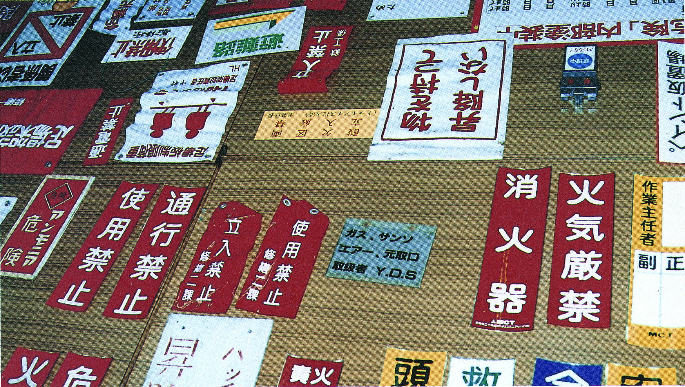
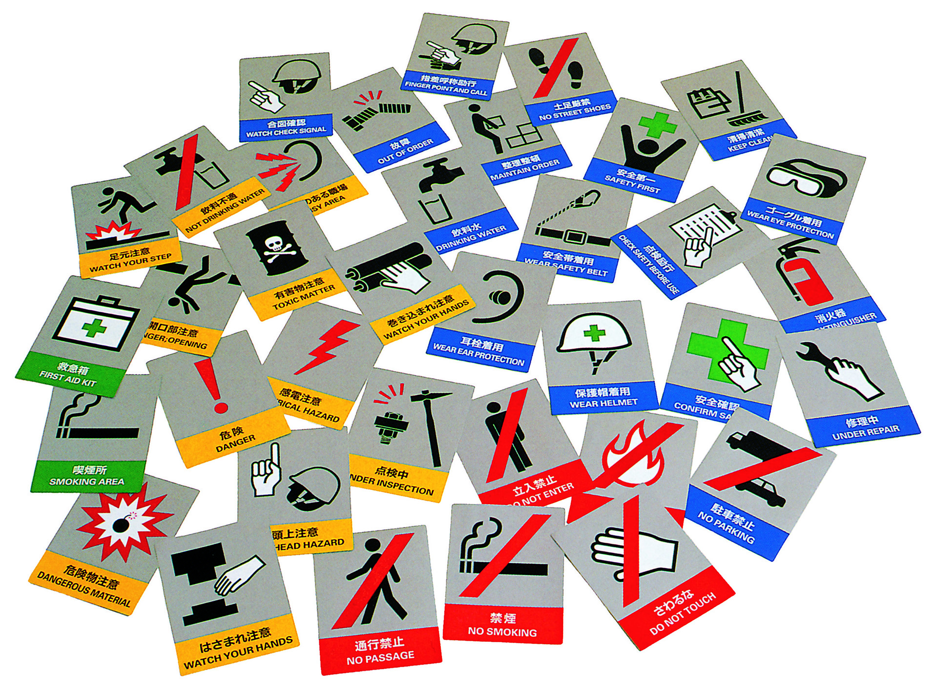
Text-based signs were replaced with pictograms. (click to enlarge)
Nonetheless, many of these signs are not consistent with the ISO standard (frames such as a circle (“○”), triangle(“△”), or square (“□”)), as JISHA proposal were not approved by the international committee. In designing signs for public use, the designer’s uniqueness or characteristics are uncalled for, just as air and water have no flavor at all. I see such an egoistic design approach as a critical issue that misunderstands the value of self-reflection when designing elements for the public interest.
Creating a symbol that is not unique but natural
The international guidelines specify hazard signs be designed with frames such as a circle (“○”), triangle(“△”), or square (“□”). However, these frames have been raising issues recently, as the shapes make the elements inside very small and illegible, especially when the symbols are placed on a map. As a solution, I focused on visualizing the contrast between danger and safety, and designed the evacuation symbols with a combination of red and green colors.
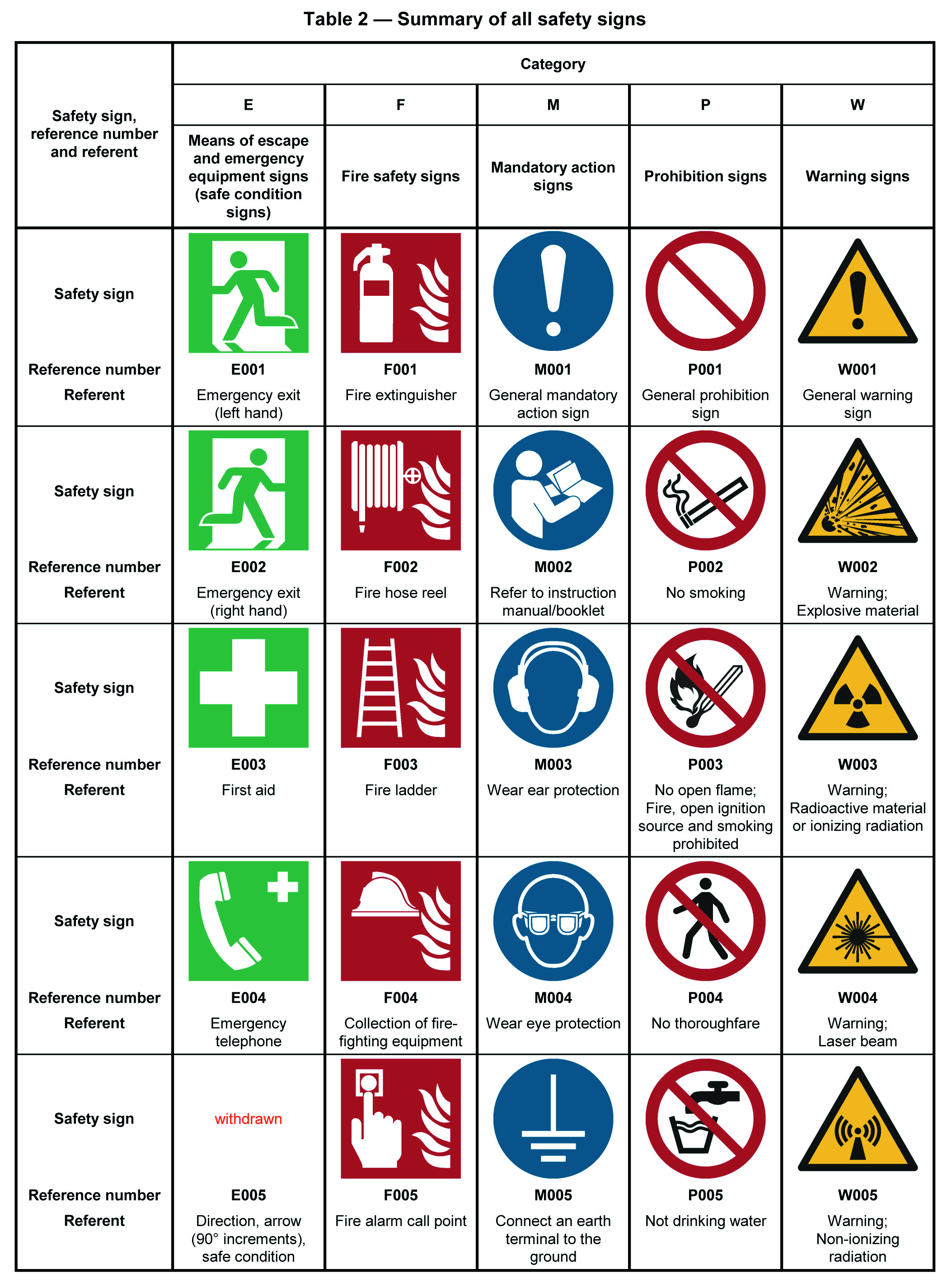
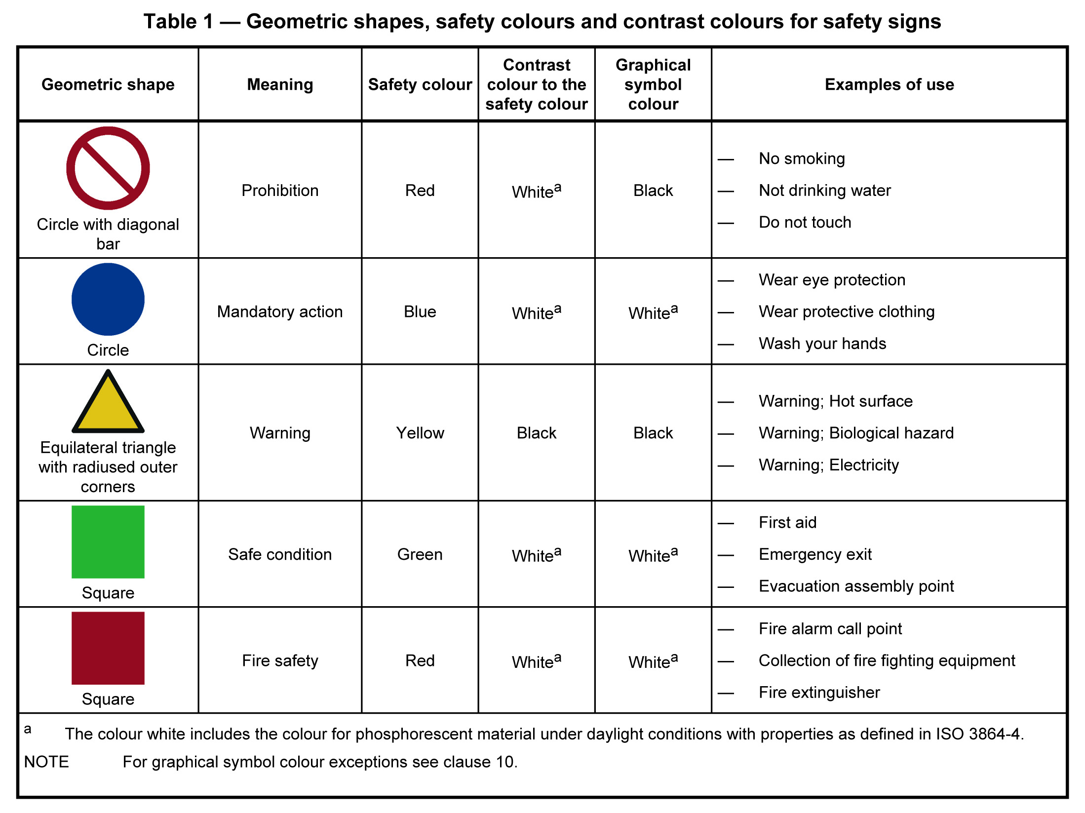
ISO safety signs and the international guidelines for the color and design principles for safety signs. (click to enlarge)
A pictogram for safety evacuation areas already existed before the Great Hanshin-Awaji Earthquake. In the early 1970s, a sign that represented safety evacuation areas, designed with a blue square, was installed in Yokohama station. An opening was placed on the bottom side of the square, inside which a cross symbol in green color was drawn. It spread in the Kanto region. An industry-government-academic committee was later established to select graphical symbols representing disasters such as fires and flood tides. In this initiative, I was tasked with the design of a new pictogram for safety evacuation area. Upon starting the design process, the committee had shown me several existing pictogram designs, but most of them were far from user-oriented. Creating a graphical symbol that is meant to be naturally integrated into people’s daily living is a whole new level of design which is fundamentally different from making a personalized artwork. It is my impression that many designers have not yet put this into practice.
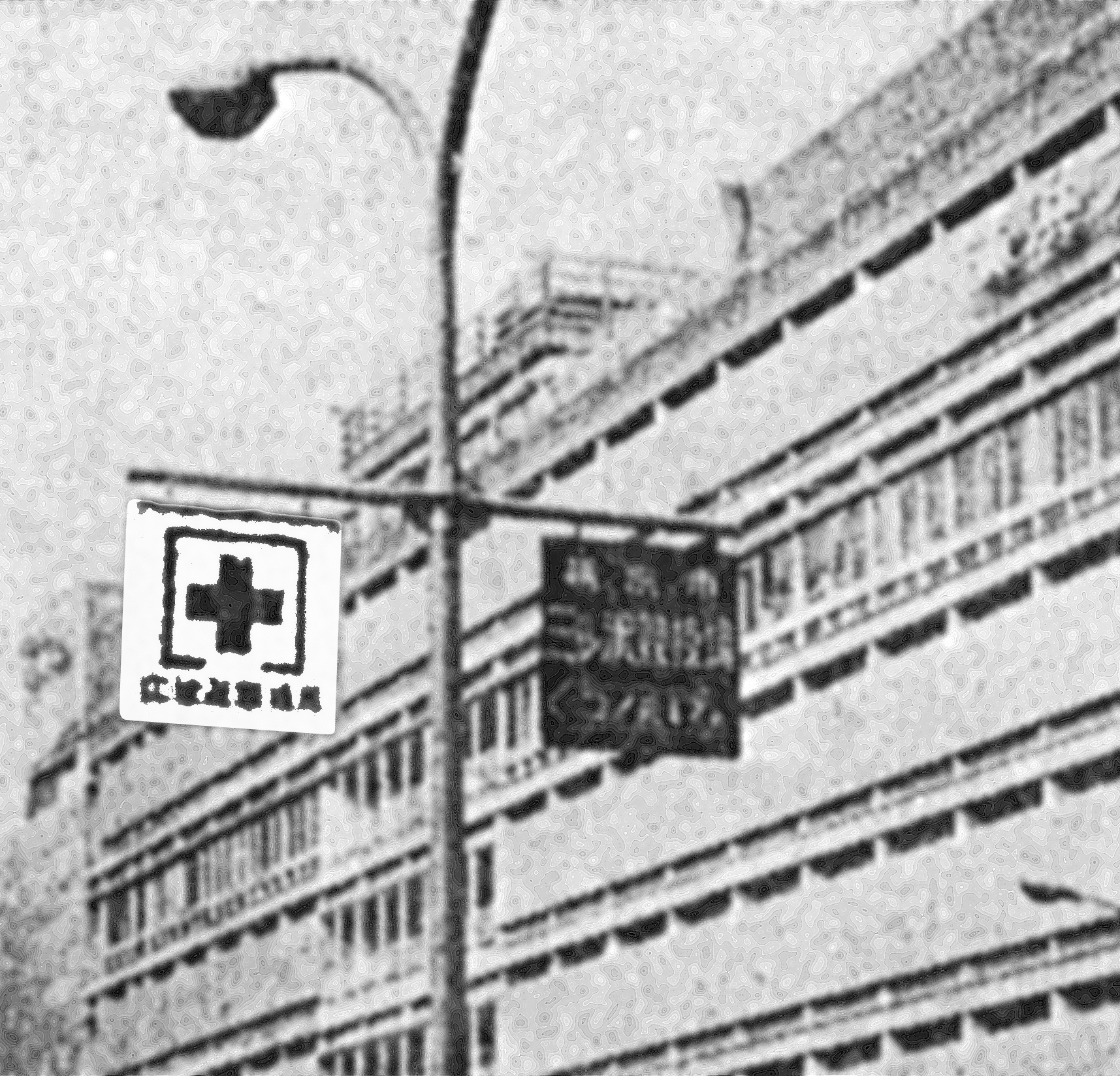
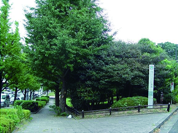
A pictogram for safety evacuation areas before the Great Hanshin-Awaji Earthquake.(click to enlarge)
Systematizing evacuation procedure in people’s daily lives
As I have said earlier, installing more signs can make it easier for people to find a safe way without getting lost. Creating such a system is indeed very important, and it does not require unrealistic costs or labor. We need a system in which everyone, including children and adults, is fully aware of the meanings of the signs in their community. We need a solution that enables people to mentally practice “emergency drill” as they see those signs in their daily lives. Building on such practices, we can then empower people to identify hazards and seek a way to keep themselves safe. This takes time, so we must begin by taking steps to create such a system in our community, as part of our daily lives. I believe we already have resources that we can utilize, such as street lamps, utility poles.
From signs for banning to signs that serve needs
At the moment there are few opportunities for new and emerging artists to propose new ideas for public safety & hazard pictograms. The selection process for new public pictograms is also not transparent. In an ideal world, everyone should be able to participate in the process of proposing, discussing, and refining the design ideas, but there is no space for this to happen in the current environment.
Once I was invited to give a lecture at my old elementary school. I asked the children to design pictograms, and their responses were truly amazing. None of their pictograms were intended to give orders or ban actions, but to visualize hazards they had identified. Their approach for making a safer community was completely different from our conventional ways of thinking about safety signs. A similar approach is seen in some mega cities in Europe. There, the concept of safety street signs is shifting from being a banning mechanism to the one that encourages drivers to move and stop based on their needs. The idea of no-banning, or elimination of street signs has become an important factor for people living there in pursuit of a safer and better city.
After the Great East Japan Earthquake
After the Great East Japan Earthquake hit Japan, I visited the Sanriku, a coastal region in northeastern Japan. The local administration was not only lacking experience with an unprecedented complex disaster, but the public safe way guidance system was also insufficient, and I felt that this, together with the enormous damage that impacted the region, had created confusion. It seems that the situation has not changed since then, and because of that I feel that now is the perfect time to identify what can be done through public design. In addition to accountability for what has happened in the past, it is necessary to present a future plan that incorporates design strategies and methods as well as implementation and dissemination ideas.
Having experienced these disasters, I recently published the following two books in partnership with the joint members (100 companies and 125 individuals) of the Refuge Guidance Sign Total System (RGSS).
(introductory book) “Anshin Anzen No Pikutoguramu” (pictograms for safety and relief), by Yukio Ota, 2016, Forum 8 Publishing. ¥3,500
(Manual) “Hinan Yudo Sain Tohtaru Shisutemu” (Evacuation Guidance Sign Total System), by Yukio Ota and RGSS participating members, 2017 ¥3,500
From Japan to the world: developing an international standard for emergency sign pictograms
A pictogram for the “emergency exit” is critical to ensure seamless and safe navigation from the emergency exit to the nearest public evacuation area. The emergency exit pictogram, displaying the image of a human figure running through the exit, is widely recognized not only in Japan but worldwide. It was originally created in Japan and adopted as the international standard after its submission to the International Organization for Standardization (ISO). The idea for the pictogram was developed in the early 1970s in Japan following multiple fire events in public buildings sustained a number of casualties. These included the 1972 Sennichi department store fire in Osaka Prefecture, and the 1973 Taiyo department store fire in Kumamoto Prefecture. These tragedies raised public awareness about the effectiveness of text-based signs which were written in Chinese characters ― 非常口. This led to discussions, which involved Ota, regarding the development of a pictogram for emergency exits.
Due to budget constraints, the design project organized an open-callout to collect proposals. Approximately 3,300 proposals were submitted. Following a scientific screening process, which included legibility and psychological effect, the submissions were narrowed down to one finalist. The chosen design was then refined by experts, such as Ota, and submitted to the ISO as Japan’s proposal.
A few years before Japanese group made their submission, Russia had also proposed a similar pictogram, using a human figure running out an exit. Although the Russian proposal had been in the final review for the International Standard, Ota highlighted the design excellence of his proposal, thus winning the competition after Russia voluntarily withdrew its proposal. The Japanese design was approved as the official ISO design after a slight amendment was made to the original, closing the bottom of the image.
The competition had stirred up public interest, with headlines reading “Japanese-European War” appearing in some media. Reflecting on his project, Ota later shared his view, noting the important fact that the designers in both countries had not known each other, yet had developed the same idea, and that the project proved pictograms are a universal concept which allowed for global understanding. (Satoshi Fujitsuka)
Reference Materials
(2008) Chikyukibo no mondai wo kaiketsu suru tameni chokkan dake de wakariaeru ‘Kansei gengo’ wo. Consensus. November 2008 Issue, Consensus Editorial Department, pp. 4-7.
FOMS (2009). Communication Design 1 Inochi wo mamoru dezain. YUSHIKAN Publishing Co., Ltd., pp.76-77.
(2015) Nihonhatsu Sekaihyojun dezain! ‘Hijoguchi sain’. President. September 14, 2015 Issue, President Inc., p. 89.

Initial research
Initial Research
Date
March, 2001
Background & Objectives
To make an easy-to-understand, nation-wide universal sign that guides evacuees to an evacuation area in case of a disaster.
Outline
Mr. Ota designed a pictogram for safety evacuation area which was later adopted by MLIT (the Japanese Ministry of Land Infrastructure, Transport and Tourism) and endorsed by the safety signs investigation committee organized by the Fire and Disaster Management Agency of Japan.
Founder/Organizer
Ministry of Land Infrastructure, Transport and Tourism, Fire and Disaster Management Agency
Partner Organizations/Companies
“Tsutaeru: Hansin Awaji Daishinsai No Kyokun” (Lessons learned in the Great Hanshin-Awaji Earthquake), editorial supervision by Follow-up Committee for the Great Hanshin-Awaji Earthquake Relief Effort, Page 43.
